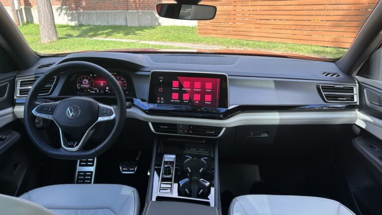
Volkswagen interiors are a contentious point of concern these days. The company went all-in on a new minimalistic theme that eschewed buttons, fully embraced an all-new infotainment system and generally looked futuristic. As you probably already know, it was not met with praise to say the least. From the infuriating unlit temp and volume sliders, to a slow and poorly laid out touchscreen user interface, the cabin controls were bad enough to be a dealbreaker for many. Thankfully, Volkswagen has now backtracked and is making big, largely successful changes by reintroducing buttons among other “illuminating” updates in the pursuit of making the new interiors user-friendly. Now, you might be thinking that since the 2024 Volkswagen Atlas and its two-row Atlas Cross Sport sibling were significantly updated for 2024 that they’d be getting those same course-correcting updates. That’d be a no, as the Atlas launched before the first new VW introduced with its new interface, the ID.7. Still, it’s a shame that other 2024 model year VWs get the new system, most notably the ID.4, and the 2024 Atlas doesn’t.
It’s true the Atlas and Atlas Cross Sport get a new interior design with fewer buttons, bigger screens and a modern, minimalistic style clearly related in concept and look to what you’ll find in the ID.4 and GTI. As you can see below, the result is a remarkably different cabin for better and for worse. The “worse” bit is related to the fact that the previous cabin was substantially easier to use, even with older tech and a smaller touchscreen. Crucially, the Atlas and Atlas Cross Sport also don’t get those same updates that so improved the ID.4. Effectively, Volkswagen is setting itself up for yet another update, hopefully sooner than later.
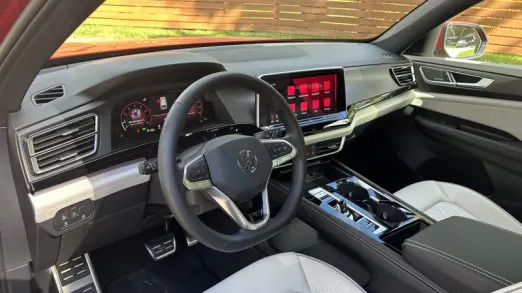
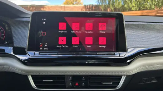
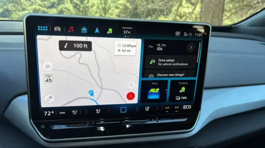
Upon settling into the SEL Premium R-Line’s quilted leather seats – they’re really quite nice and classy looking – the focal point is the widescreen 12-inch infotainment system perched on and virtually floating on the dash. Unlike the earliest versions of this system, it is quick to boot up and react. It does not, however, get the new software, home screen and permanently docked band of climate controls at the bottom and customizable menu shortcuts on the top that you’ll find in the ID.4. You can see the difference between the two below, with the Atlas on the left and 2024 ID.4 on the right.
I would argue, however, that the greatest sin was the darned climate and radio controls integrated into the panel below that screen. They are not illuminated, meaning you can’t actually see what you’re supposed to run your finger over at night. The ID.4, updated 2025 GTI and new ID.7 get those illuminated, but that doesn’t change the fact that trying to change the temperature cabin or quickly use the slider volume is a huge pain even if you can see them. It’s still rather hostile to the user to make them slide their finger back and forth on a small touch target, especially while moving. You’ll quickly find accidental inputs happen far more often than they should. Even the heated and cooled seat controls aren’t great, as they’re tucked into the bottom-left portion of the touchscreen (not helpful for the passenger) at all times and tend to lag when you initially start the car up. This was corrected with the updated system, but again, the Atlas doesn’t have that.
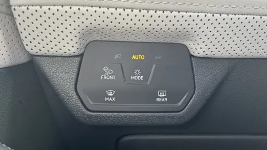
Oh, and if you were wondering where the defrost buttons were, check out the headlight touch controls (because of course they are) to the left of the steering wheel. Again, that placement is just unnecessarily difficult to find, especially if you’re driving and need to quickly get defrost power. Making it a touch control requires the driver to physically look at the control panel to press it for fear of brushing up against the headlight control – I could almost forgive this placement if it were a button that was easily found by touch alone, but as-is, no thanks. Oh, and if you’re also wondering if these defrost controls move back to where they belong in the updated infotainment system, they do not.
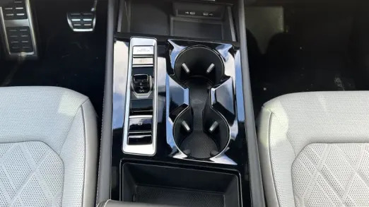
The Atlas’ new center console is at least a massive upgrade in design. Eliminating the tall gear lever for a small toggle nub has led to multiple usability enhancements, most notably the cavernous storage below the floating console. It looks perfect for a purse, a small takeout order or any number of items you might not want flying around the car. The other amenities such as a secure wireless phone charger, fast-charging USB-C ports (45-watt) and sizable cupholders are all great to see, too. Unfortunately, the space just below the touchscreen that was previously used for convenient knobs and buttons is now just for air vents and quick toggle touch controls to bring up menus on the touchscreen.
Speaking of air vents, though, the Atlas’ side vents up front sure are a neat upgrade, too. They’re dual-stacked vents that allow you to direct air to multiple locations, say one toward the window and one at your face, or whatever configuration you may prefer.
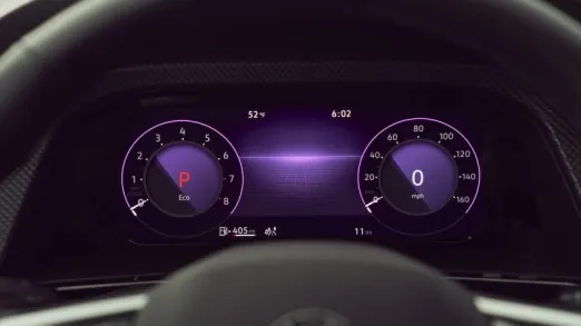
Another big positive is the steering wheel, which is the course-correcting update the Atlas did get – in fact, VW avoided the problem altogether, as the Atlas never offered VW’s touch-capacitive steering wheel controls. It features a plethora of real buttons that are both easy to use by feel and make up for some of the infotainment control’s downsides. For example, any owner will likely find themselves exclusively using steering wheel controls for volume and seeking purposes. The controls for the 10.25-inch digital cluster are found on the wheel, too, and while they take a second to learn, it’s easy-going once you get the hang of them. I really like the customization VW allows for both its gauges and the infotainment system, too – being able to choose from what feels like unlimited color themes is something we should see more often now that most new cars are filled with at least two massive screens.
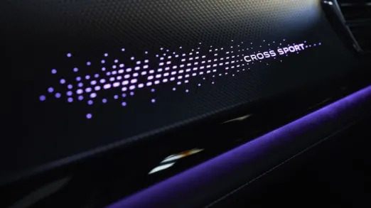
For fans of faux wood trim, that’s gone, but it’s been replaced with a fancy back-lit piece (above, bottom right) on the dash that really sparkles at night. All the piano black plastic splashed around both the center console and across the dash is a real downer for long-term durability, but when clean, it does make for a shiny look and pretty pictures.
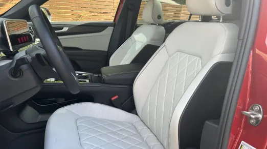
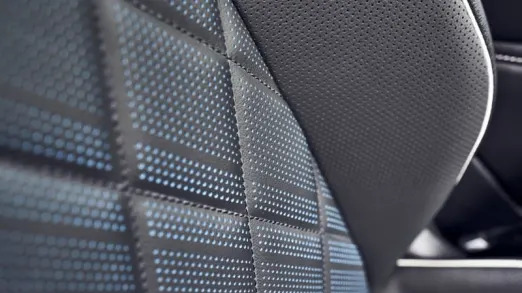
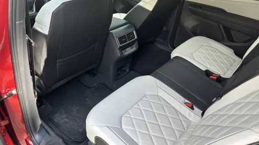
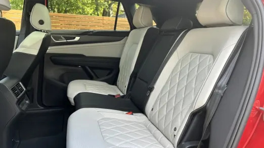
Interfaces aside, the Atlas Cross Sport is still the funky and functional SUV it was before the refresh. That means it has an exorbitantly large rear seat with a handy recline function for even greater comfort. The fully loaded model I had even came with heated rear seats, and the black/white two-tone leather is a lovely combo when combined with the Aurora Red Metallic paint of this tester. There’s an interior option with blue accents on the seats (seen above, top row) that’d be a good look when combined with the blue paint option, too.
That duality of good and bad sums up the Atlas Cross Sport’s interior in a nutshell, too. There’s a lot of good baked into the new design, but there’s just as much frustration to spoil what could be a rather enticing option. Its exterior looks superb; the turbo-four-cylinder is strong, and it’s generally a pleasant SUV to drive around. Unfortunately, its interior control issues could very well be deal-breakers, just as they were for the ID.4. It seems likely that the Atlas update was well under way once Volkswagen starting hearing such strong complaints about the new interior direction, let alone once it came up with the first wave of fixes. Still, it’s still disappointing that the 2024 Atlas shows up and is not only worse in some ways than the pre-refresh version, but several other 2024 VWs as well.
Related video:


